Children's Court
Youth Justice NSW
May 2024
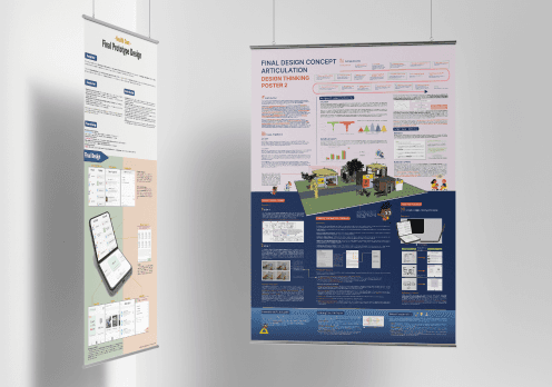
This project focused on two main areas: redesigning the original forms by simplifying terminology and incorporating friendly visualisations, and integrating a digital learning platform to optimise the pre-court process for young people. Below is a brief overview of our design approach.
Why we help young people?
In the youth justice context in New South Wales (NSW), Australia, much of the evidence points to a high frequency of misunderstandings that invariably occurs in the legal process for young people, and more notably young people are often ambiguous in terms of their understanding of the court's order, and the next steps they need to take.
Young people have a limited understanding of the justice system and legal forms in juvenile delinquency, which influenced by various factors, including parental accessibility, cultural divisions, and regional differences. Although these conditions affecting adolescents' senses and acceptance of justice administration, miscommunication issues cannot be overlooked. Miscommunication issues have been repeatedly cited in literature, government reports, and staff interviews as an urgent concern to be addressed.
Design approach
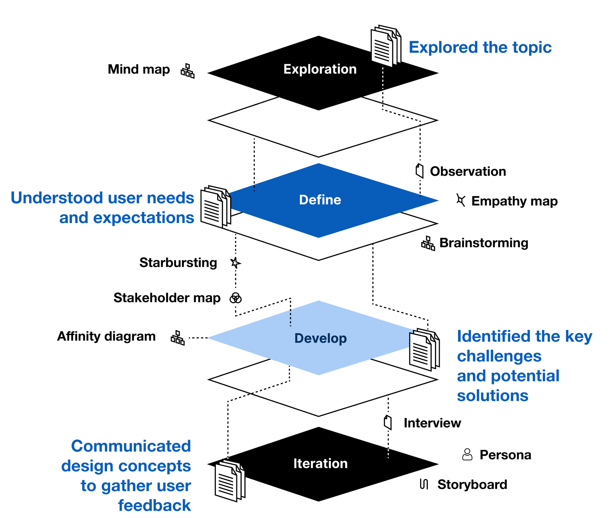
In exploring how to better engage young people in the legal process, we adopted a structured approach: Exploration, Define, Develop, and Iteration. Through observation, empathy mapping, and stakeholder interviews, we pinpointed key challenges and user needs. Subsequently, we brainstormed and prototyped solutions. Continuous feedback and iteration ensured that our final designs effectively tackled communication barriers and enhanced accessibility.
Key Insights from Research
Through analysis of the YJNSW annual report, the original AVO form, client feedback, and discussions with Children Court staff and social workers, we identified three main areas where miscommunication issues arise:
The term and format are not conducive to children's understanding.
Young offenders with reading disabilities face significant challenges.
Paper forms have limited appeal and effectiveness.
The idea
Through a series of research and analysis, we focused on using visual forms and digital platforms to facilitate a better understanding and engagement with legal knowledge and the justice experience among young people. Specifically, our team aims to ensure that legal procedures and documents are effectively communicated to young people with domestic violence offenses.
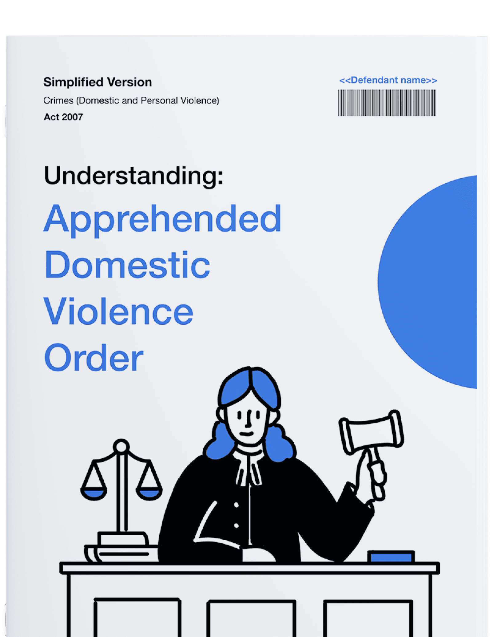
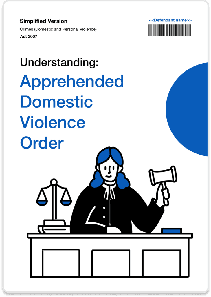
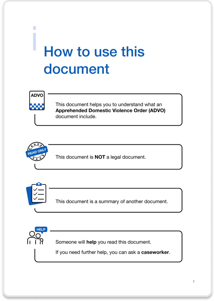
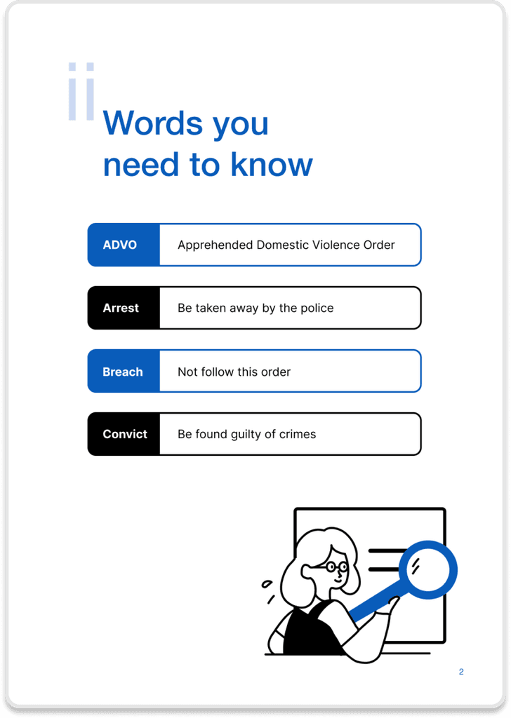
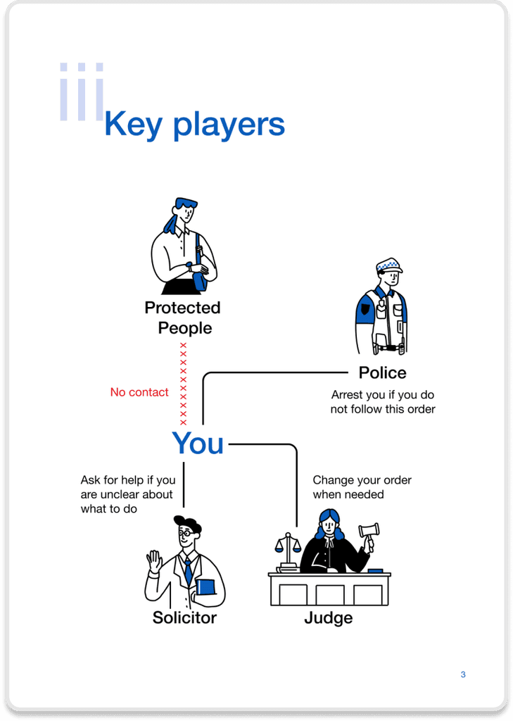
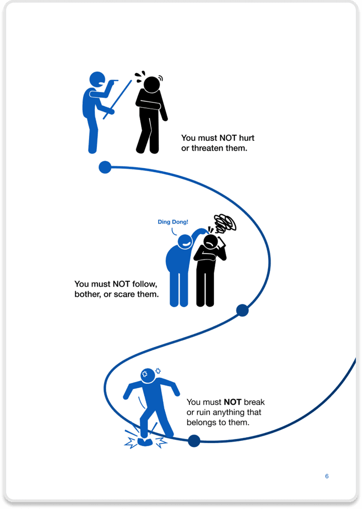
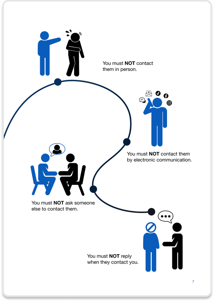
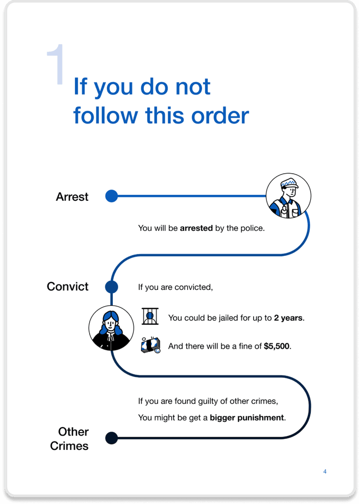
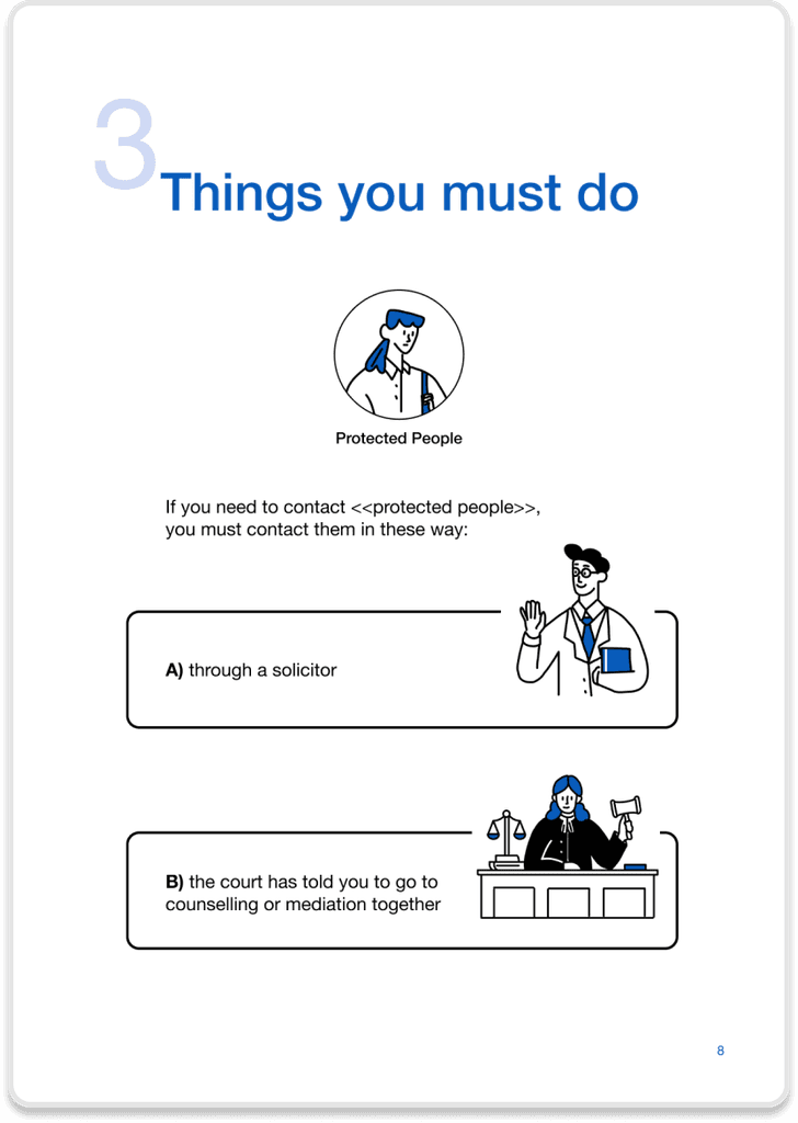
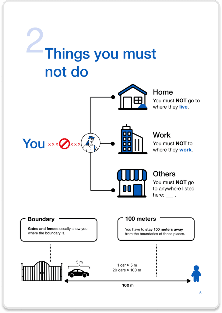
We simplified terminology, used friendly visualisations, and alleviated anxiety in the AVO form. Thus, when obtaining the official AVO form, youth with reading disabilities will be given this simplified version as a supplement.
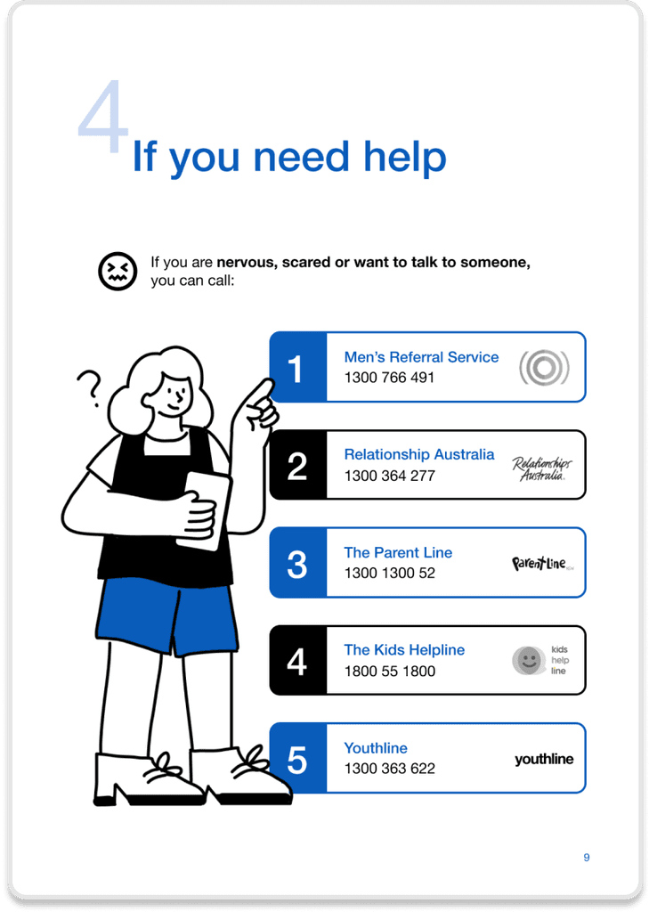
We developed a youth-friendly educational platform named Youth Just. This platform offers simplified interactive learning and easy access to resources and support services for young people. Additionally, it generates learning outcome reports for social workers and judges to identify areas where young people need further understanding.
User flow
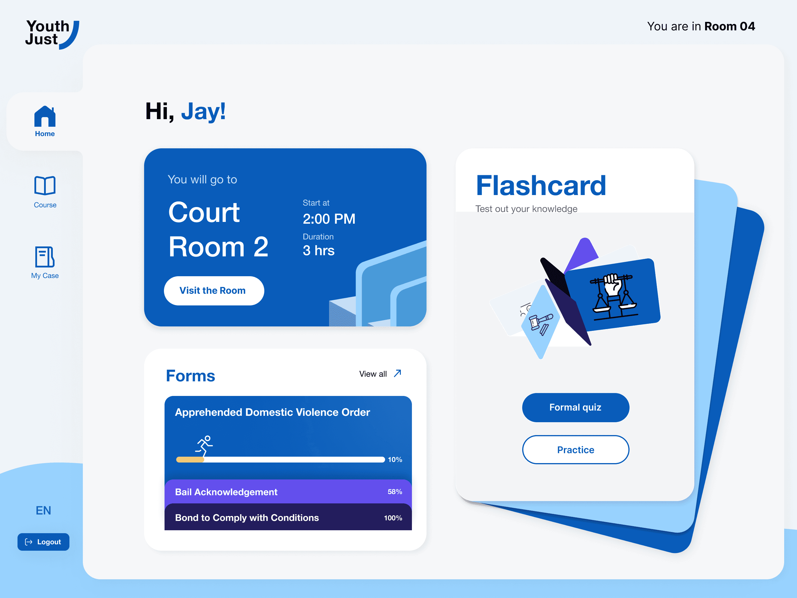
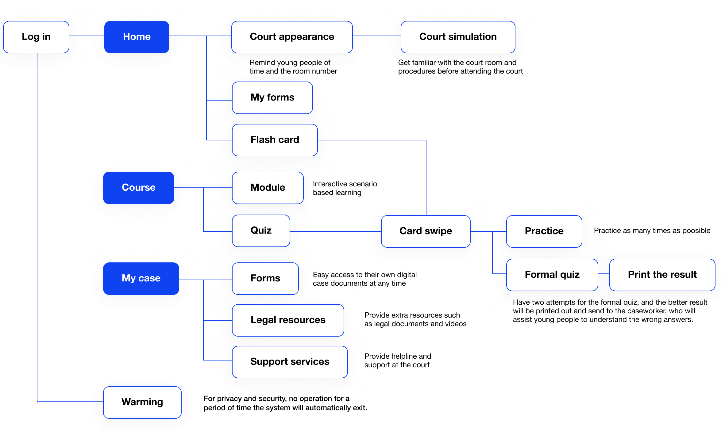
The user interface of the Youth Just platform is divided into three main sections: Home, Course, and My Case. The Homepage features two key highlights: Court Appearance and Flash Card.
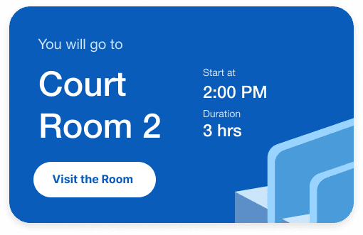
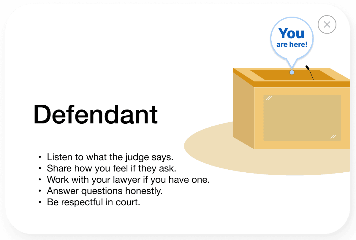
Court Appearance: This section reminds young people of their court time and room number. It also provides an interactive feature where users can familiarise themselves with the courtroom layout and procedures before attending court. Users can click on different areas to understand who sits where and what their roles are.
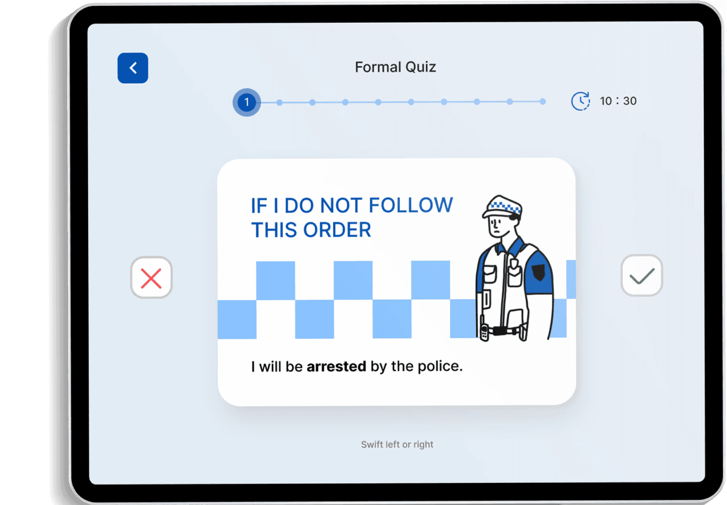
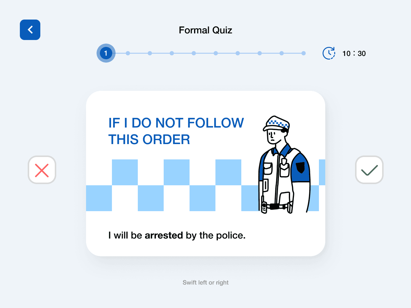
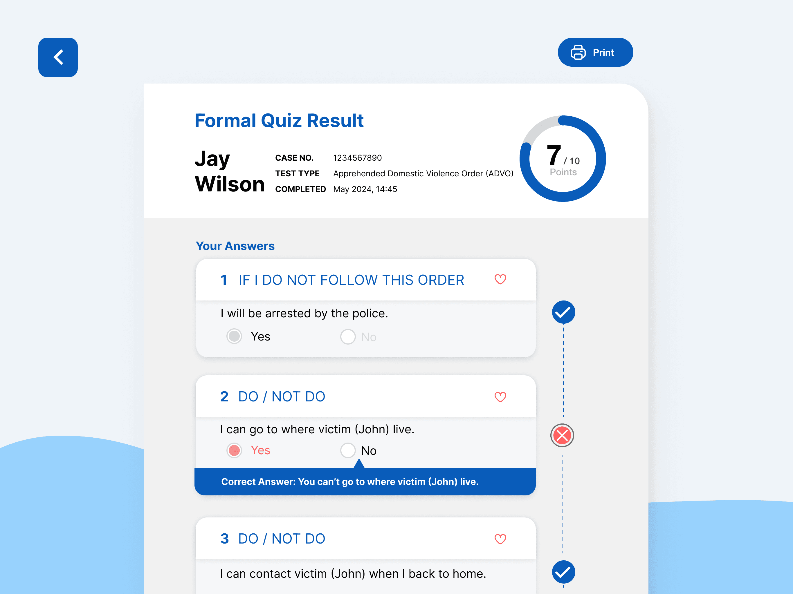
Flash Card: This feature offers a practice and quiz format, with questions derived from the AVO form. It helps young people review and test their knowledge in an engaging way.
The design system
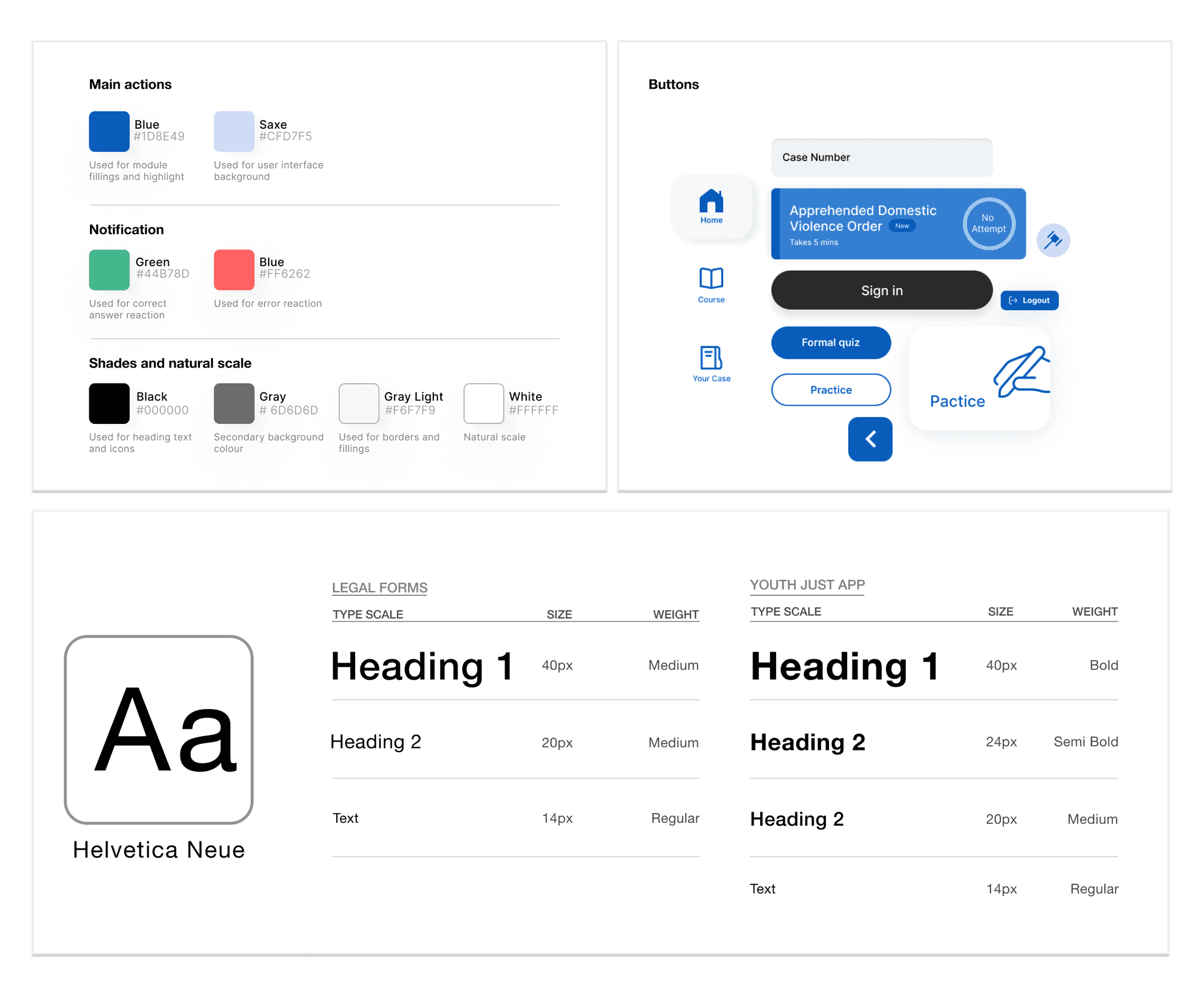
In the design process, our group used Figma to create visual tables and the necessary components, templates, and shared styles for the user interface, forming a simple design system to speed up the workflow.
Firstly, we created a colour palette, font scales, and spacing options to enhance consistency and accelerate decision-making. Then, she integrated these elements into a smaller palette and created a brief guide on colour usage. For most projects, you only need to use colours for the following five elements: header text, secondary text, borders, backgrounds, and actions. The colour guide includes:
Dark Blue: Used to create a more cohesive aesthetic.
Light Colours (such as white): Used in blank areas to focus the user's attention.
Functional Colours: Using green and red to differentiate functions, avoiding the use of excessive bright colours.
The brand
My group members created a simple and meaningful brand identity, which can also be considered the symbol of the entire system:
Logo: she started with the "Helvetica Neue" font, making subtle manual adjustments to the spacing and font scale.
Symbol: A quarter arc connecting the two lines of text in the logo, reflecting the idea of communication and connection.
Theme: Conveying a sense of optimism, friendliness, and comfort. The black text conveys the identity and purpose of the project, while the blue symbolises support and inclusivity.
Colours: We chose blue and black for the brand logo to ensure universal appeal and align with the main colour tones of our content.
The Idea in Practice
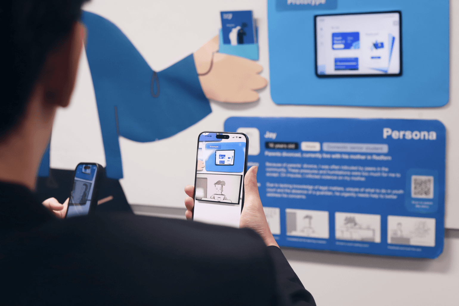
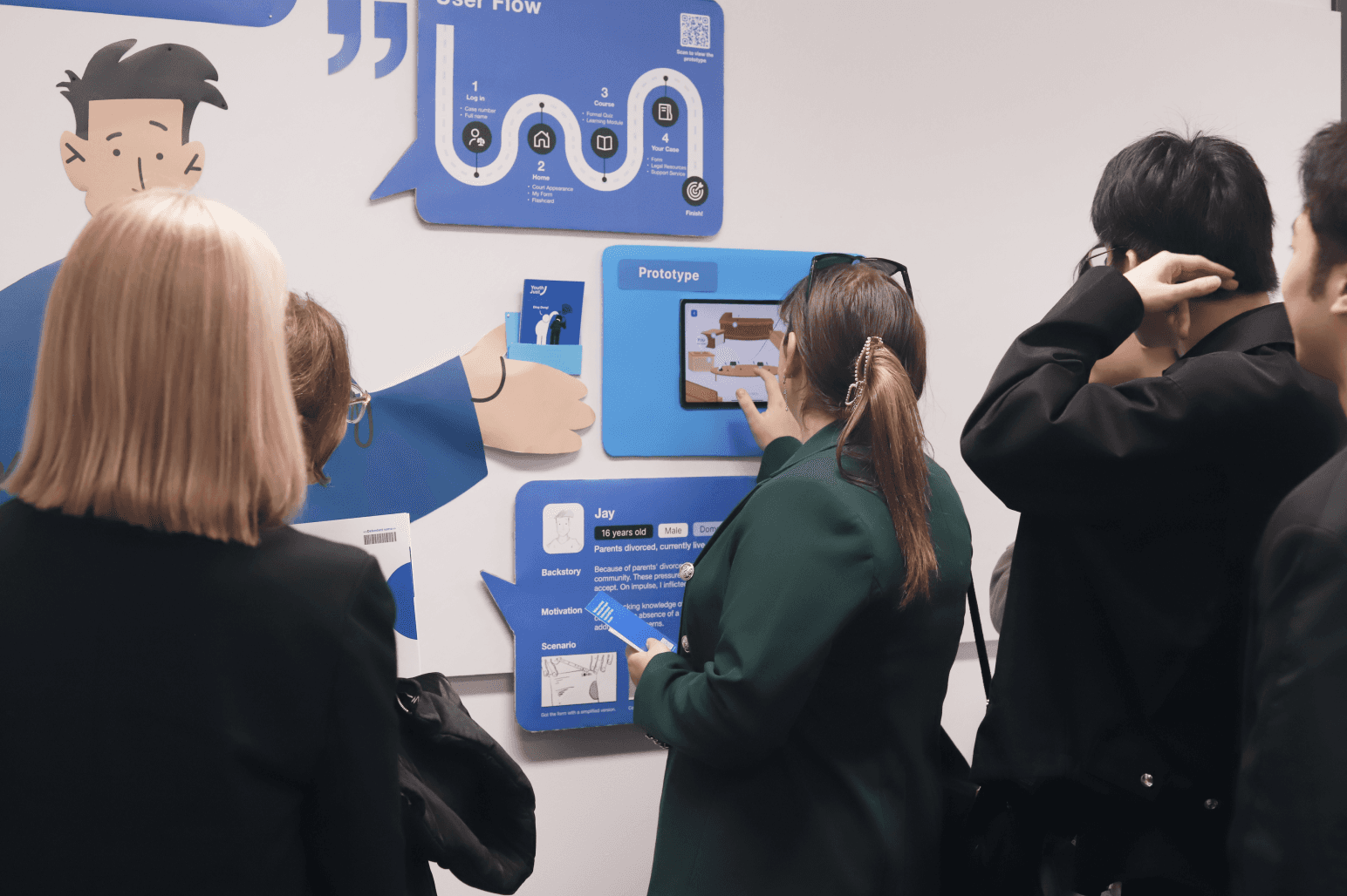
"The Idea in Practice" is our approach to help young people navigate the legal system effectively. Activities like receiving AVO orders, participating in court simulations, and accessing digital learning platforms assist users like Jay in understanding legal procedures and their rights. By following our structured user journey map, individuals can efficiently prepare for court appearances and access supportive services.
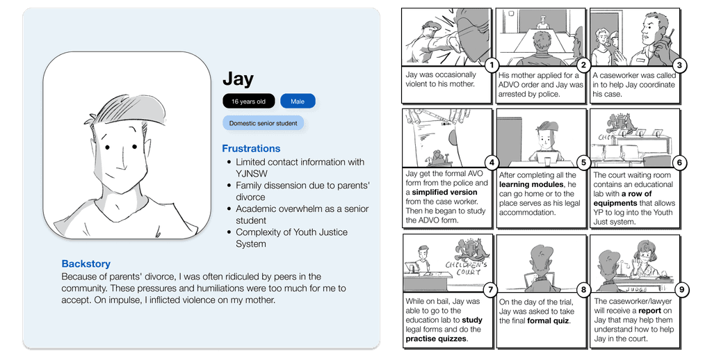
Persona
Jay, a 16-year-old domestic senior student, represents the challenges faced by many young people navigating the legal system. Motivated by a desire to understand legal rights and improve communication skills, Jay's persona helps tailor solutions to his specific needs, such as simplified legal education and access to supportive services.
Storyboard
The storyboard visually depicts Jay's journey through the legal system, highlighting key interactions and challenges. By outlining his experiences, we can identify areas for improvement in our design solutions and ensure they effectively address user needs.
Reflection
For non-law students and local students like me, knowledge of youth law and legal procedures is quite unfamiliar. This made the initial stages of the project very slow. However, after four meetings with the client, I finally established the workflow and sourced the forms, identifying pain points and proposing solutions.
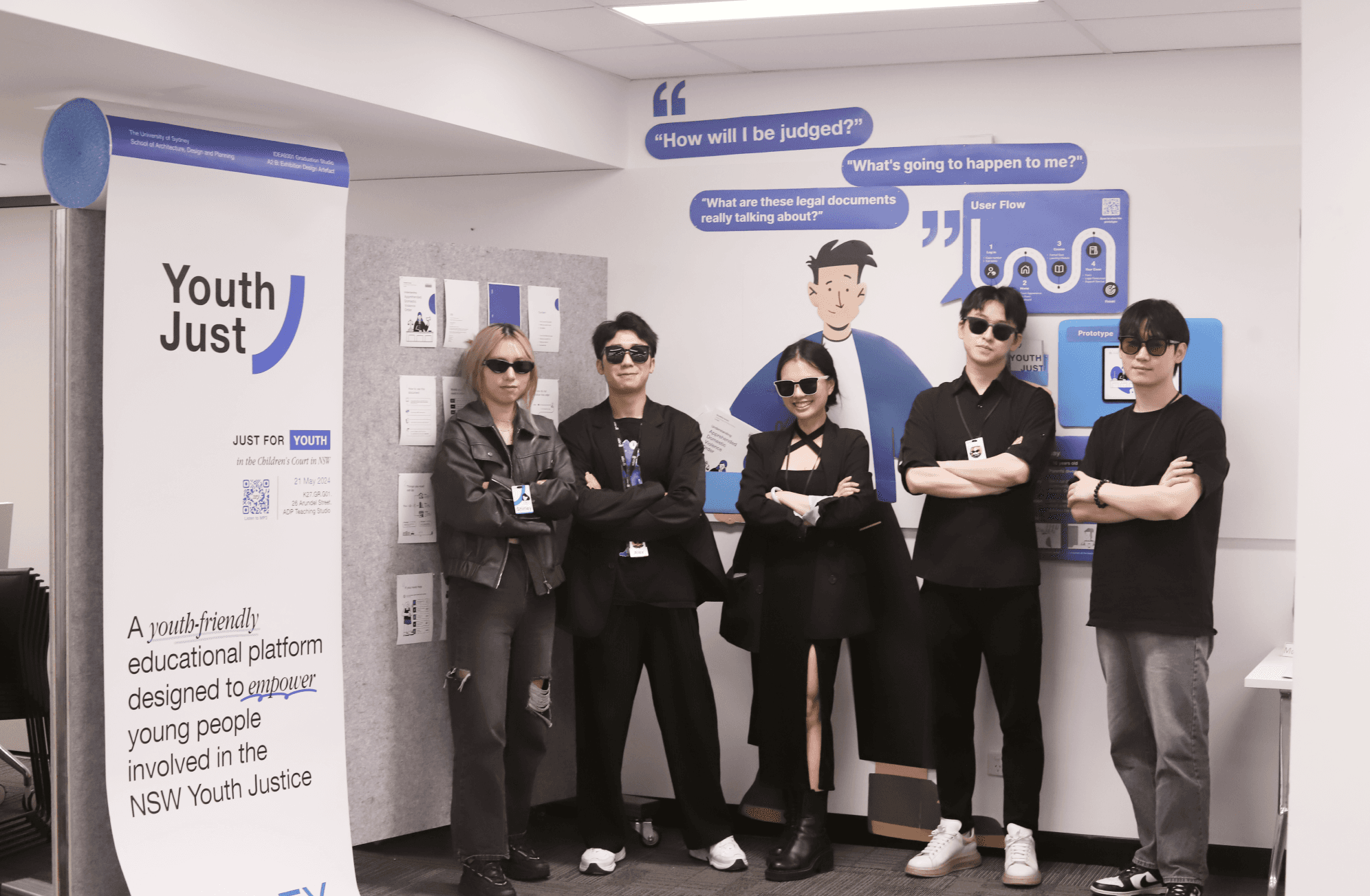
Our team members systematically conducted background research, client interviews, and prototype development. Throughout the Children's Court project, I was involved in the entire process, especially in the visual design of the digital platform, as well as the interaction design of the prototypes. I also contributed ideas and implementation for the final exhibition.
